In data analytics cultures where fast production decisions have become the norm, sprint reviews tend to follow a familiar ritual: an A/B test result goes up on screen, the p-value gets read out, and a decision is made. If p is small, the feature ships. If it’s big, it gets killed. The data scientist says “we couldn’t find a significant difference,” the PM reads that as “so it doesn’t work.” But these two sentences aren’t saying the same thing. The first one could also mean the data wasn’t sufficient. The second one is a definitive judgment. The gap between them often closes before anyone notices. “The data has spoken, let’s move on.” This flow feels so natural that the question “did the data actually speak, or did it just shrug?” rarely comes up.
Separating what a p-value says from what it doesn’t say — that’s not a thought that fits easily into the daily workflow. The number on the dashboard is either green or red, and the decision is either ship or kill. But as I explored from a different angle in my previous post, seeing p = 0.18 doesn’t mean “there’s no difference.” What you’re actually saying is: “with this sample, in this timeframe, with this metric, I couldn’t demonstrate a difference.” The distance between these two can sometimes be as wide as a feature’s fate.
And the reverse is equally true. Seeing p = 0.002 doesn’t mean “we found a big difference” — it means “we found a difference, and if there were actually no difference, the probability of observing something this extreme by chance alone is low.” Whether the difference is big or small — that’s not written in that number. When you run a test with 90,000 users, even a half-percentage-point wiggle can come out “statistically significant.”
In this post, I want to work through the gaming industry — a sector I’ve been following closely for a long time. The data we’ll use comes from a mobile puzzle game called Cookie Cats.
NoteCookie Cats
: Cookie Cats — a match-3 puzzle game developed by Tactile Entertainment.

The Gate, the Wait, and a Design Choice
It used to be quite popular — you can probably guess that from the fact that it became the subject of an open A/B test dataset involving more than 90,000 players. The thing being tested is a simple design decision: as the game progresses, players hit a “gate” — and this gate requires either waiting for a certain amount of time or making an in-app purchase to continue.
These gates might seem like they’re blocking the player at first glance, but they’re a deliberate design choice. They tap into a psychological phenomenon called hedonic adaptation: by forcing the player to take a break, they slow down the erosion of the pleasure they get from the game. At the same time, you’re monetizing the urge to continue — the player who’s forced to pause at a point “chosen for them” becomes more attached through deprivation; and the player who makes an in-app purchase already has money invested, which creates a stronger retention tendency.
The question is: should this gate go at level 30 or level 40? Simple question, simple test, and we’ve got real users in the dataset.
Every new player was randomly assigned to one of two groups: those in gate_30 hit the gate at level 30, those in gate_40 hit it at level 40.
This was set up like a randomized controlled experiment — and that matters. Random assignment is designed to ensure there’s no systematic difference between the two groups other than the gate position. Similar players, same time period, same game (in economist terms: ceteris paribus) — the only thing that changes is where the gate sits. The dataset has 90,189 players and the groups are nearly equal: 44,700 in gate_30, 45,489 in gate_40.
What we’re measuring is retention — whether the player came back. The dataset has two retention metrics: whether the player returned 1 day after installing the game and 7 days after. Both are binary — yes or no. In mobile gaming, retention is a critical metric: the business model usually depends on the player sticking around. Revenue structures like ads and in-app purchases start with the player consistently coming back. A player who’s still playing 7 days later can be considered “retained” — their long-term value is probably high.
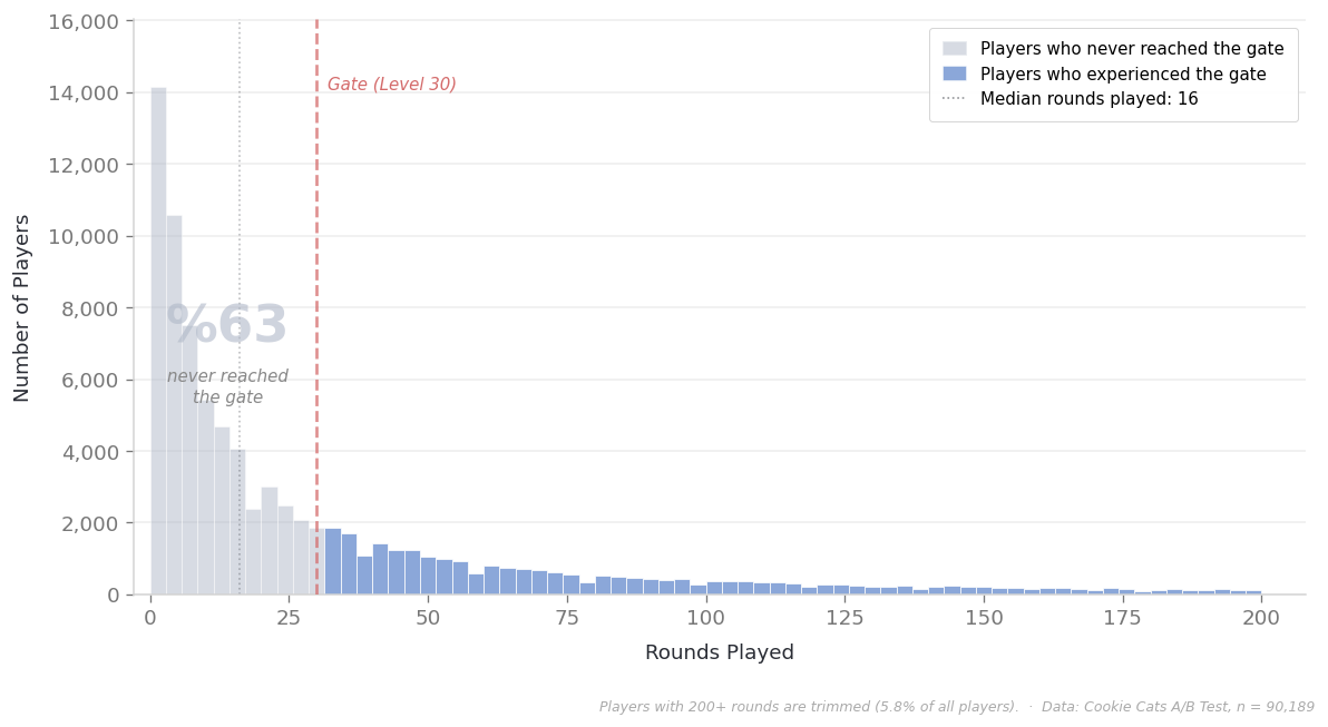
There’s also sum_gamerounds, which shows how many rounds the player completed in the first 14 days. You can think of this as engagement level, but the distribution is skewed — the median is 16 rounds, meaning more than half the players stayed below 16. Only about a third of all players even reached level 30, where the gate is. This detail matters, and we’ll come back to it.
Looking at this chart, a natural question comes to mind: if two-thirds of the players never even reached the gate, what’s the point of including them in the analysis?
NoteWhy Include Players Who Never Reached the Gate?
We wouldn’t expect a difference between gate_30 and gate_40 for someone who never saw the gate. If we filtered them out and focused only on those who experienced the gate, wouldn’t we get a cleaner comparison?
It sounds logical, but there’s a trap. How many rounds a player completes isn’t independent of which group they were assigned to. A player in gate_30 might hit the wall at level 30 and quit. The same player, had they been assigned to gate_40, might have continued to level 35 since there was no wall yet. In other words, how many rounds you play is partly shaped by the treatment itself. When you say “filter to 30+ rounds,” you’re actually cutting away part of the effect — how the gate position shaped the player’s playing time. More importantly, a player in gate_30 who chose to continue despite the gate and a player in gate_40 who hasn’t encountered the gate yet may no longer be comparable profiles. The initial random assignment guaranteed that the groups were balanced. Filtering breaks that guarantee.
This dilemma actually extends beyond A/B tests — it’s a well-known issue in clinical trials too. In medicine, it’s called intent-to-treat: patients are analyzed according to the group they were assigned to, regardless of whether they actually received the treatment. The reason is essentially to preserve the balance that randomization provided. The alternative — analyzing only those who actually received the treatment (per-protocol) — is a legitimate approach but answers a different question, and carries the risk of the selection bias I mentioned above.
We’ll go with the intent-to-treat approach here. All players included, whether they reached the gate or not. This is also consistent with how the product decision actually works in practice: when you move the gate, you move it for all players, not just the ones who reach it. But it’s worth keeping in mind: the effect we see in the overall result might be diluted by a large pool of players who never saw the gate. The real effect is likely more pronounced among those who actually experienced it.
7-Day Retention: p = 0.0016
Now let’s get to the real question: does the gate position affect retention? We’re looking at 7-day retention. In the gate_30 group, 19.02% of players came back. In gate_40, 18.20%. The difference is 0.82 percentage points, in favor of gate_30.
n_30, n_40 = len(gate_30), len(gate_40)

ret7_30 = gate_30["retention_7"].mean()
ret7_40 = gate_40["retention_7"].mean()

abs_diff = ret7_30 - ret7_40       # absolute difference (percentage points)
rel_diff = abs_diff / ret7_40       # relative difference

print(f"gate_30 retention (7-day): {ret7_30:.2%}")
print(f"gate_40 retention (7-day): {ret7_40:.2%}")
print(f"Absolute difference: {abs_diff:.2%} percentage points")
print(f"Relative difference: {rel_diff:.1%}")
gate_30 retention (7-day): 19.02%
gate_40 retention (7-day): 18.20%
Absolute difference: 0.82% percentage points
Relative difference: 4.5%When we test the difference between these two proportions, we get p = 0.0016.
successes = np.array([gate_30["retention_7"].sum(),
                      gate_40["retention_7"].sum()])
samples   = np.array([n_30, n_40])

# pooled proportion altında iki oran testi
p_pool = successes.sum() / samples.sum()
se = np.sqrt(p_pool * (1 - p_pool) * (1/n_30 + 1/n_40))
z_stat = (ret7_30 - ret7_40) / se
p_value = 2 * (1 - stats.norm.cdf(abs(z_stat)))

print(f"z = {z_stat:.3f},  p = {p_value:.4f}")
z = 3.164, p = 0.0016That’s a pretty convincing number. p = 0.002 roughly says this: if there were truly no difference between the two groups, the probability of observing a difference this large or larger just by chance would be around two in a thousand. A low probability. Well below the conventional 0.05 threshold. If you showed this result in a sprint review, the decision would probably come fast: keep the gate at 30, don’t move it to 40, the data supports it. And technically, this interpretation isn’t wrong — the data is pointing to a difference.
But we need to stop here and ask: the result is surprising enough, but how big is it?
There’s a 0.82 percentage point gap. Let’s make that concrete. Out of 100 players, 19 come back in gate_30, 18 in gate_40. The difference — the player “saved” by the gate position — is less than 1 in 100. If we express this using a concept borrowed from medicine: NNT (Number Needed to Treat) = 122. You need to apply this gate position to 122 people to change one player’s behavior. For the remaining 121, there’s no practical difference between the two groups.
# NNT — Number Needed to Treat
# How many players do you need to apply this gate position to
# in order to change one player's behavior?
nnt = 1 / abs(abs_diff)
print(f"NNT: {nnt:.0f}")

# Cohen's h — standardized difference between two proportions
# Cohen's d is for means, h is for proportions.
h = 2 * (np.arcsin(np.sqrt(ret7_30)) - np.arcsin(np.sqrt(ret7_40)))
print(f"Cohen's h: {h:.3f}")
# Interpretation scale: |0.2| small, |0.5| medium, |0.8| large
NNT: 122
Cohen's h: 0.021Effect Size: h = 0.021
Cohen’s h — the standardized version of the difference between two proportions. Here it comes out to 0.021. In the widely accepted classification: 0.2 is “small,” 0.5 is “medium,” 0.8 is “large.” 0.021 is practically at the bottom of that scale — you could call it “negligible.” If you overlaid the retention distributions of the two groups, they’d overlap almost completely. If you shuffled the groups and split them randomly, you’d probably observe a similar “difference.”
So why did the p-value come out so small? The answer lies in the sample size — something I explore in detail with football analytics data in my previous post. We’re working with a 90,000-person dataset. With a sample this large, even tiny differences become statistically “surprising,” because the range of chance fluctuations narrows. As the sample grows, the test gets more sensitive — it can detect smaller and smaller wiggles. That’s not a problem in itself. The problem starts when “detectable” and “important” become synonymous in our heads.
Should this drive a product decision? Maybe. But the answer to that question doesn’t live purely in the statistics — it extends into the economics of the business: what’s the marginal return and opportunity cost of a small shift, which other metrics and dynamics get affected, is it worth the analytical and managerial effort to capture that marginal return?
Statistics tells you that the difference you observed is probably real. Whether the difference matters — that’s not its job to tell you.
# 95% confidence interval
se_diff = np.sqrt(ret7_30 * (1 - ret7_30) / n_30
                + ret7_40 * (1 - ret7_40) / n_40)
ci_low  = abs_diff - 1.96 * se_diff
ci_high = abs_diff + 1.96 * se_diff
print(f"95% CI for the difference: [{ci_low:.2%}, {ci_high:.2%}] percentage points")
95% CI for the difference: [0.31%, 1.33%] percentage pointsWe also computed the confidence interval: the 95% CI for the difference lands between 0.31 and 1.33 percentage points. It offers some perspective on the size of the effect, but you need to be careful here. A 95% confidence interval doesn’t claim “the true difference is within this range” — the true difference could fall outside it too. What the confidence interval actually says is:
If you applied this method over and over, 95% of the intervals you construct would contain the true value.
You don’t know whether this specific interval does or doesn’t. Still, it’s useful for sizing the effect: what we’re talking about is at most a 1–2 percentage point impact.
extra_retained = abs_diff * n_40
print(extra_retained)373.06885906040173What’s the Practical Payoff?
There are 45,489 players in the gate_40 group. When we multiply the 0.82-point absolute difference by that number — calculating how many people in the total pool the difference corresponds to — we get roughly 373 players. Out of 45,000, 373 players’ behavior differed depending on the gate position. For the remaining ~45,000, there’s no practical difference between the two groups.
And when you try to convert this difference into money, things get even more complicated. According to Sensor Tower’s 2016-17 data, Cookie Cats’ average net revenue per download was $0.63 ($2M total revenue, 3.2M downloads).

-
Cookie Cats revenue and download data. Source: Sensor Tower, 2016-17 period.
But you can’t directly multiply $0.63 by the 373 extra retained players — because that $0.63 is the average across a player’s entire lifecycle, including those who dropped off on day one. What we care about is the marginal additional revenue that a player who’s still around on day 7 will generate from that point forward. That’s not something we can calculate directly from this dataset — there’s no revenue data, only retention. You could make a rough estimate from the ARPDAU benchmarks of the era (Kern’s 2017 presentation suggests ~$0.15–$0.18 for puzzle games), but that would be an estimate on top of an estimate. Actually measuring the marginal economic value of retaining a user — translating an A/B test outcome into a causal economic impact — is a field of its own. Causal inference deals exactly with these kinds of questions; for those interested, my dear friend Yiğit Aşık’s blog is one of the best starting points you’ll find.
The magnitude we’re talking about is a few hundred dollars — we’re not even in the thousands range. Where that stands relative to the cost of an engineering sprint is a question every company needs to answer for themselves.
I showed how small these kinds of differences can be in my previous post using football pressing data — with 3,646 matches, p < 0.001 came out, but the effect was negligible. The same dynamic applies here: a large sample makes small differences “statistically surprising.” But what it means in practical terms depends entirely on the economics of the business.
So far we’ve looked at one side of the coin: we got a significant result, but the effect itself is nearly invisible. Now let’s flip to the other side — let’s look at 1-day retention. Same 90,000 players, same groups, same test. The only thing that changes is the metric’s time window.
ret1_30 = gate_30["retention_1"].mean()
ret1_40 = gate_40["retention_1"].mean()
abs_diff_1 = ret1_30 - ret1_40

# z-test
p_pool_1 = (gate_30["retention_1"].sum() + gate_40["retention_1"].sum()) / (n_30 + n_40)
se_1 = np.sqrt(p_pool_1 * (1 - p_pool_1) * (1/n_30 + 1/n_40))
z_1 = abs_diff_1 / se_1
p_value_1 = 2 * (1 - stats.norm.cdf(abs(z_1)))

# confidence interval
se_diff_1 = np.sqrt(ret1_30 * (1 - ret1_30) / n_30 + ret1_40 * (1 - ret1_40) / n_40)
ci_low_1 = abs_diff_1 - 1.96 * se_diff_1
ci_high_1 = abs_diff_1 + 1.96 * se_diff_1

print(f"gate_30 retention (1-day): {ret1_30:.2%}")
print(f"gate_40 retention (1-day): {ret1_40:.2%}")
print(f"Absolute difference: {abs_diff_1:.2%} percentage points")
print(f"z = {z_1:.3f},  p = {p_value_1:.4f}")
print(f"95% CI: [{ci_low_1:.2%}, {ci_high_1:.2%}]")
gate_30 retention (1-day): 44.82%
gate_40 retention (1-day): 44.23%
Absolute difference: 0.59% percentage points
z = 1.784, p = 0.0744
95% CI: [-0.06%, 1.24%]1-Day Retention: Proving the Absence
gate_30 shows 44.82%, gate_40 shows 44.23%. The difference is 0.59 percentage points. And p = 0.074 — above the conventional 0.05 threshold, “not significant.”
If a PM saw this result, what would they say? Most likely: “Day-1 retention isn’t affected by the gate position. Let’s move to the next metric.” A note gets added to the dashboard, case closed.
But look at the confidence interval: it spans from -0.06 to +1.24. What does that mean? The true difference could be very close to zero, or it could be as large as 1.24 percentage points. The data isn’t telling you “there’s no difference” — it’s telling you “with this level of precision, with this sample, in this timeframe, I couldn’t demonstrate a difference.” The gap between these two can be as wide as a feature’s fate.
In the Scottish legal system, a jury can deliver three verdicts: guilty, innocent, or “not proven”. Most legal systems only have the first two — but Scotland recognizes a third option: the evidence wasn’t sufficient for conviction, but the defendant’s innocence wasn’t proven either. p > 0.05 is actually exactly that verdict: “not proven.” But we read it as “innocent.” We say, “no difference, case closed.”
Can we actually test this? If we want to say “there’s no difference,” we need a different kind of test — one designed not because we failed to show a difference, but to demonstrate equivalence.
In standard hypothesis tests, the starting assumption is “no difference.” If the data convinces you enough, you say “there is a difference.” But the only things this test can say are “there’s a difference” or “I’m not convinced.” “There’s no difference” is never the output of this test. Staying silent is not the same as agreeing.
In an equivalence test, we flip the question: the starting assumption is “there is a difference.” If the data convinces you enough, you say “there’s no difference — at least not one of a size I care about.” For this, you first define the boundary of “a size I care about” yourself — say, ±1 percentage point. Then the test checks whether there’s enough evidence to show that the observed difference falls within those bounds.
Two different tests, two different questions. The first asks “is there enough evidence to convict the suspect,” the second asks “is there enough evidence to acquit.” The answer to both can be “no” — and then what you’re left with is the Scottish verdict: “not proven.”
# TOST — Two One-Sided Tests (equivalence test)
# Question: "Is the difference between the two groups smaller than ±1 percentage point?"

delta = 0.01  # ±1 percentage point equivalence margin

# Upper bound test: is the difference < +delta?
z_upper = (abs_diff_1 - delta) / se_diff_1
p_upper = stats.norm.cdf(z_upper)

# Lower bound test: is the difference > -delta?
z_lower = (abs_diff_1 + delta) / se_diff_1
p_lower = 1 - stats.norm.cdf(z_lower)

p_tost = max(p_upper, p_lower)

print(f"Equivalence margins: ±{delta:.0%} percentage points")
print(f"Observed difference: {abs_diff_1:.2%}")
print(f"TOST p-value: {p_tost:.4f}")
print(f"Result: {'Equivalent — difference within ±1pp' if p_tost < 0.05 else 'Inconclusive — cannot prove equivalence either'}")

# Let's try with ±2pp
delta_2 = 0.02
z_upper_2 = (abs_diff_1 - delta_2) / se_diff_1
p_upper_2 = stats.norm.cdf(z_upper_2)
z_lower_2 = (abs_diff_1 + delta_2) / se_diff_1
p_lower_2 = 1 - stats.norm.cdf(z_lower_2)
p_tost_2 = max(p_upper_2, p_lower_2)

print(f"\nEquivalence margins: ±{delta_2:.0%} percentage points")
print(f"TOST p-value: {p_tost_2:.4f}")
print(f"Result: {'Equivalent' if p_tost_2 < 0.05 else 'Inconclusive'}")
Equivalence margins: ±1% percentage points
Observed difference: 0.59%
TOST p-value: 0.1080
Result: Inconclusive — cannot prove equivalence either
Equivalence margins: ±2% percentage points
TOST p-value: 0.0000
Result: EquivalentEquivalence Test: TOST
With ±1 percentage point margins, TOST comes out inconclusive. We can’t prove equivalence. We can’t say “there’s a difference,” and we can’t say “there’s no difference.” Even with 90,000 users, the data is telling us “I don’t know.”
This is a test that almost never gets run in daily practice. Most of the time the flow goes like this: run the test, if p > 0.05 say “no effect,” move on. But saying “no effect” also carries a burden of proof. Failing to show a difference is not the same as showing there is no difference. It’s a bit like shouting someone’s name in a noisy crowd — if you don’t get a response, that doesn’t mean they’re not there. Maybe they were, but your voice didn’t reach them. If you shouted louder or the crowd thinned out, maybe they would have heard.
Sample Size and Detection Power
So far we’ve encountered two different outcomes: 7-day retention gave us p = 0.0016, “significant difference found” but the effect was nearly invisible. 1-day retention gave us p = 0.074, “no significant difference” but we couldn’t prove the absence either. Both results came from the same 90,000 players, the same test. The only thing that changed was the metric we looked at.
But what if the thing that changed was the sample size? What would we see if we looked at the same reality in the same data, but through windows of different sizes?
We can actually test this. Let’s draw random subsamples of different sizes from the Cookie Cats data and run the same 7-day retention test on each. The reality hasn’t changed — the 0.82-point difference is always there. We’re only changing how many players we look at.
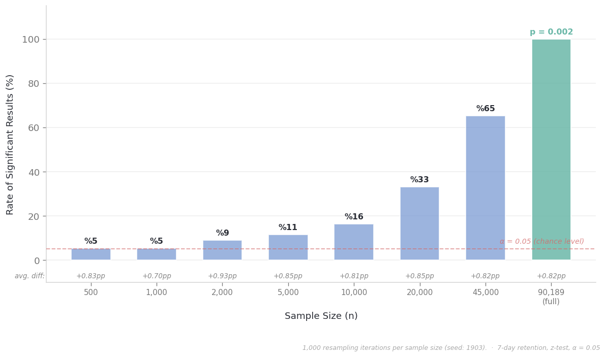
Something should stand out in this chart: the first three bars — 500, 1,000, 2,000 people — sit right at the red line. That line represents 5%, and what it means is this: even if there were truly no difference between the two groups, 5% of tests would come out significant purely from sampling luck. So if a test produces significant results at a 5–6% rate, it’s essentially unable to distinguish a real signal from noise. Same informational value as flipping a coin.
Think of it this way: a product team runs an A/B test with 5,000 users. The result comes out non-significant. The PM says “the feature didn’t work, let’s kill it.” But if they’d tested the same feature with 90,000 users, p = 0.002 would have come out. The feature got killed — but because of insufficient data, not because of an ineffective feature. And nobody knows this, because nobody asked “was our test powerful enough to catch an effect of this size?”
The Question to Ask Before Running the Test
In what I call fast-food analytics cultures, the A/B testing process tends to look like this: build the feature, start the test, wait a while, look at the p-value, make a decision. But a critical step gets skipped in this process. Because nobody thinks to ask: “How small a difference do I care about?”
This is actually a very practical question. Say you’re thinking about changing the gate position in a mobile game. The engineering cost is known — a two-week sprint. So what’s the minimum retention improvement needed for that sprint to pay for itself? 0.5 points? 2 points? 5 points?
The answer to this question should determine the design of the test. Because every test is blind to effects below a certain size, and that blindness threshold depends on sample size. This is called the MDE (Minimum Detectable Effect): the smallest difference the test can reliably catch.
Let’s give a concrete example. In a game with ~18.5% retention:
- With groups of 2,500 → your test can only reliably catch differences larger than 3 percentage points. A 0.82-point difference? Doesn’t even show up on the test’s radar.
- At 10,000 people → the threshold drops to 1.5 points. Still not enough.
- With 45,000 → the threshold falls to 0.73 points; finally, our 0.82-point difference becomes visible.
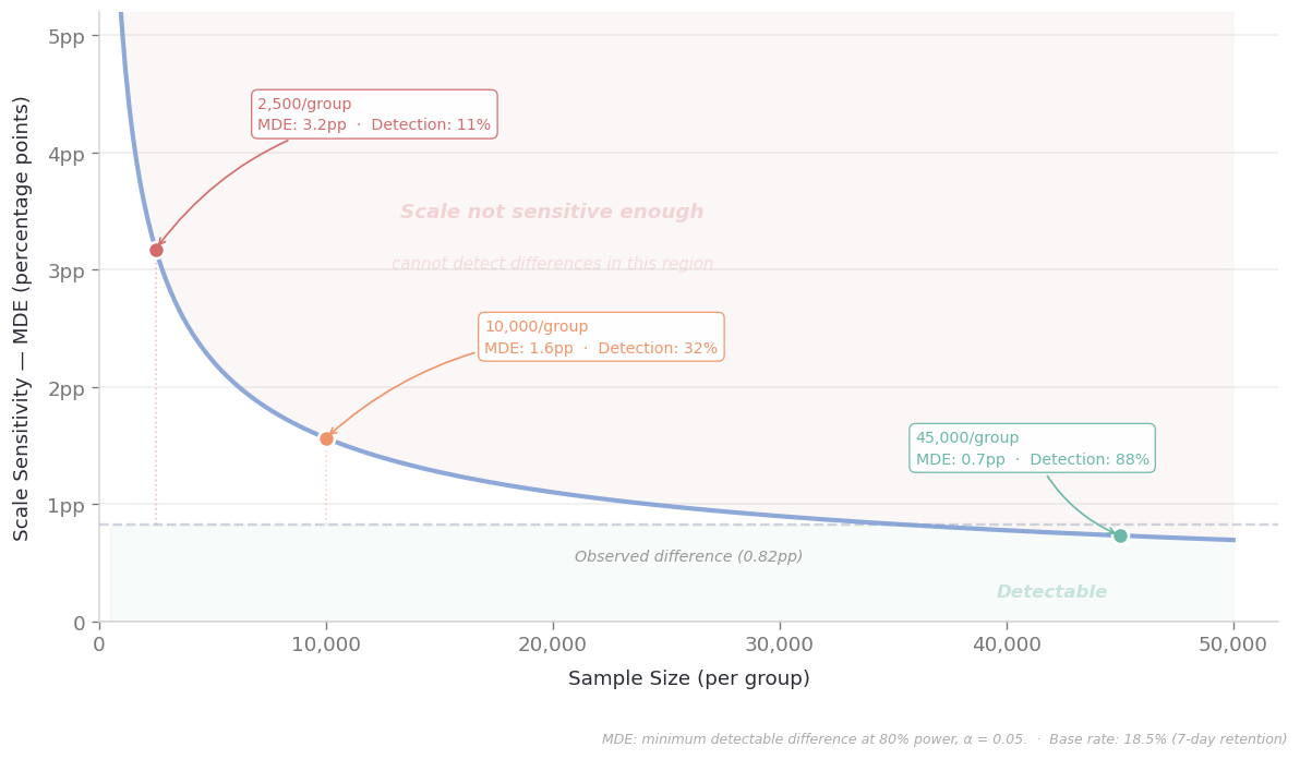
So when you’re a PM and you say “we tested with 5,000 people, it wasn’t significant, the feature doesn’t work,” what you’re actually saying is: “I looked with an instrument that can’t see differences smaller than 3 points, and I didn’t see anything.” It’s like a doctor telling a patient “your MRI is clean” — but if the MRI machine’s resolution can only show tumors larger than 5 cm, that word “clean” isn’t as reassuring as you’d think.
And the other side of the coin: with 90,000 people across two groups, your detection threshold drops to 0.73 points. With an instrument that sensitive, wiggles that mean practically nothing can still come out “significant.” The instrument is very sensitive — but sensitivity doesn’t mean importance.
Notice how the fundamental question is shifting toward this:
- How big a difference do I care about?
- Is my measurement tool powerful enough to see it?
Conclusion: An Uninformative Bet
You can think of every A/B test as a kind of bet. We have a hypothesis, we test it against the null hypothesis universe — we’re betting that our sample is large enough and our metric is sensitive enough.
A non-significant result isn’t a lost bet. It might be an uninformative bet: you shouted someone’s name in a noisy crowd, got no response, but maybe your voice didn’t carry. A significant result isn’t a won bet. It might be a trivial bet: you caught a half-percentage-point wiggle with 90,000 people, but is that wiggle worth an engineering sprint?
The quality of the bet depends on decisions made before running the test: how small an effect is meaningful for me, how many users do I need to detect that effect, what are the costs on both sides of the decision. A team that hasn’t asked “how small a difference matters to me?” lacks the framework to correctly interpret the test’s outcome. Looking at the p-value and saying “the data has spoken” is like trying to read the answer without asking the question first.
Data always speaks. But sometimes it whispers, sometimes it shouts, and sometimes it just shrugs. Knowing which one you’re hearing starts with knowing how sensitive your listening equipment is.
Data: Cookie Cats A/B Test (Tactile Entertainment, published via Rasmus Bååth). 90,189 players, 2016-17 period. Revenue data: Sensor Tower. Analyses conducted with Python (NumPy, SciPy). Seed for reproducibility: 1903.